
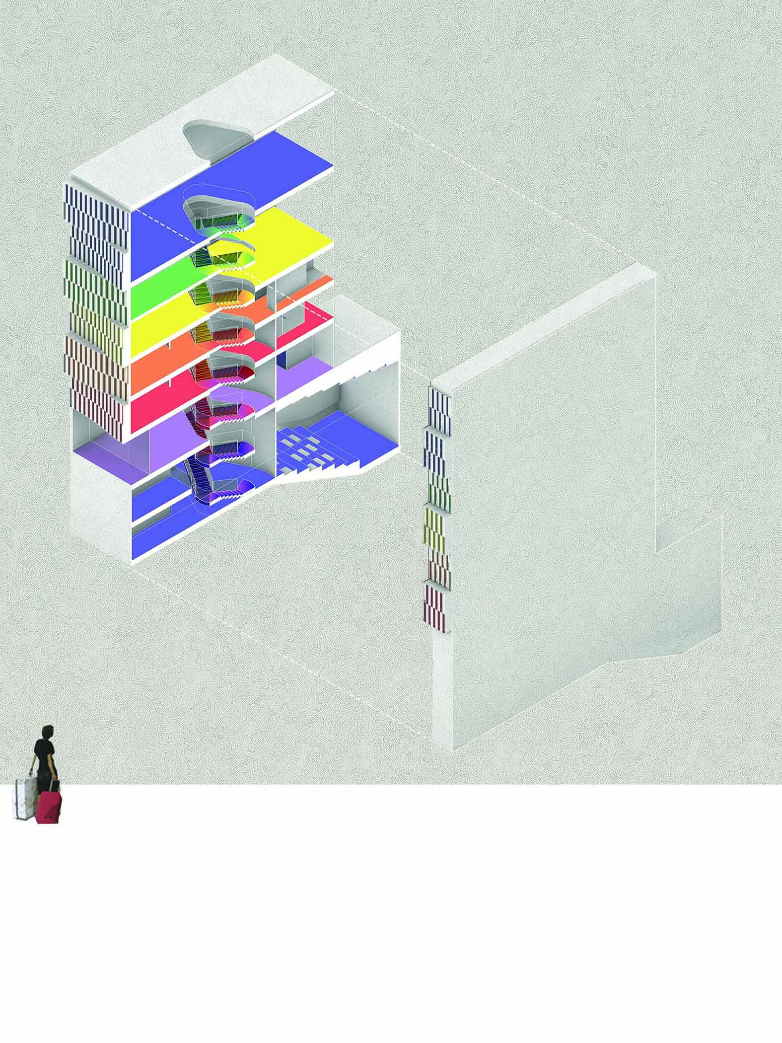
 Expand view for photograph A cutaway illustration of a multistory building with each floor colored differently, showing a spiral staircase in the center. A person with a suitcase walks near the building’s exterior.
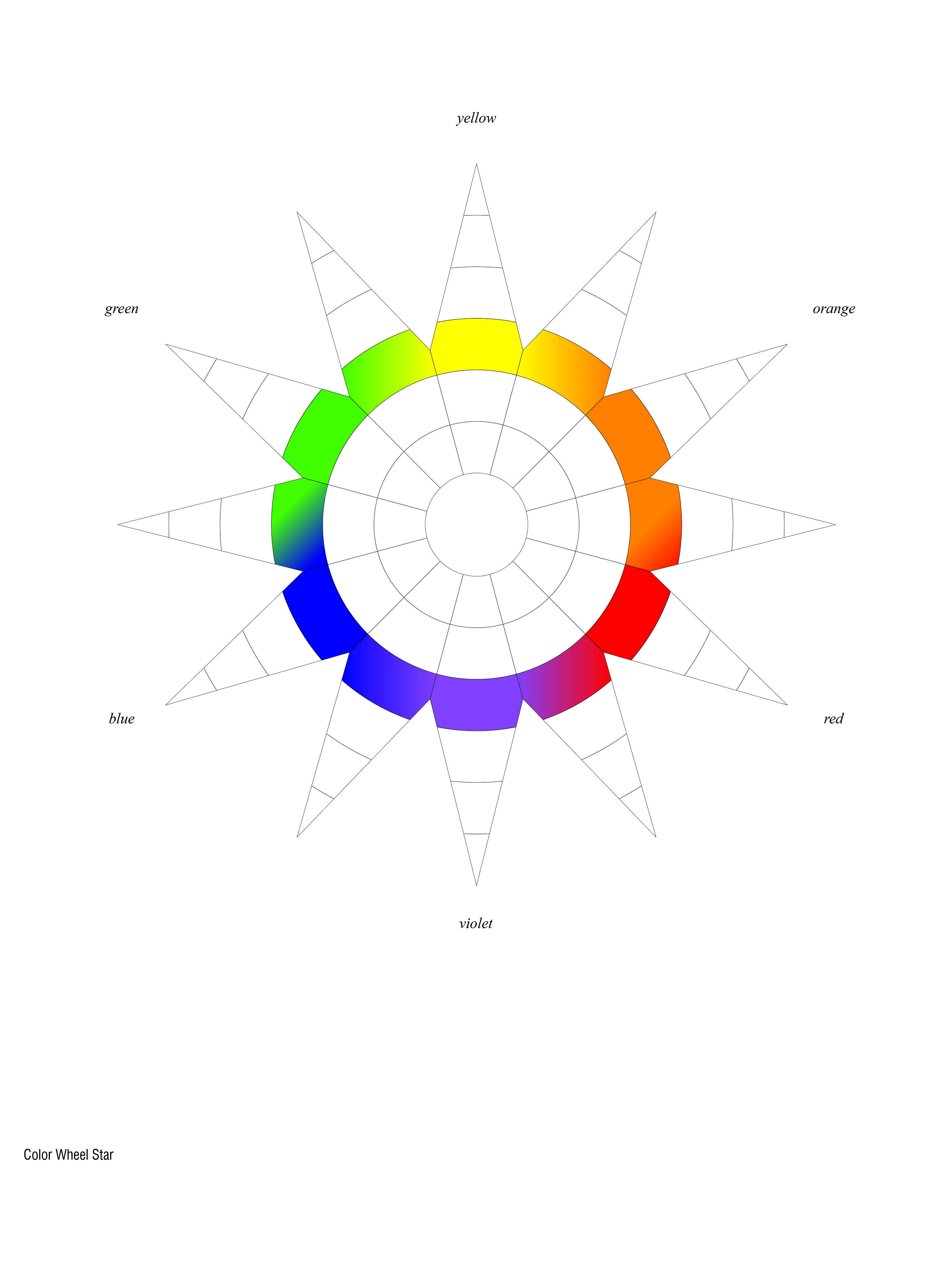 Expand view for photograph A star-shaped color wheel showing yellow, orange, red, violet, blue, and green sections, each blending smoothly into the next in a circular arrangement. The colors are labeled around the outer edges.

Located in New York City, “Circulating in Color” is a project designed to be an Institute for the Advancement of Color. The project considers color as a driver for the design and experience of the building. Color is used as a tool for the spatial experience and spatial organization.
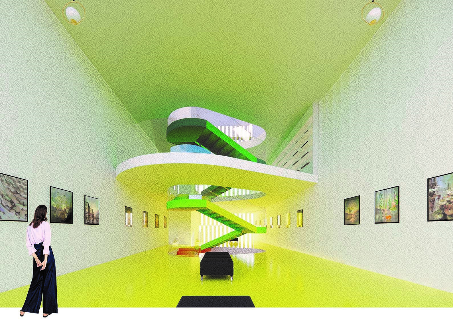
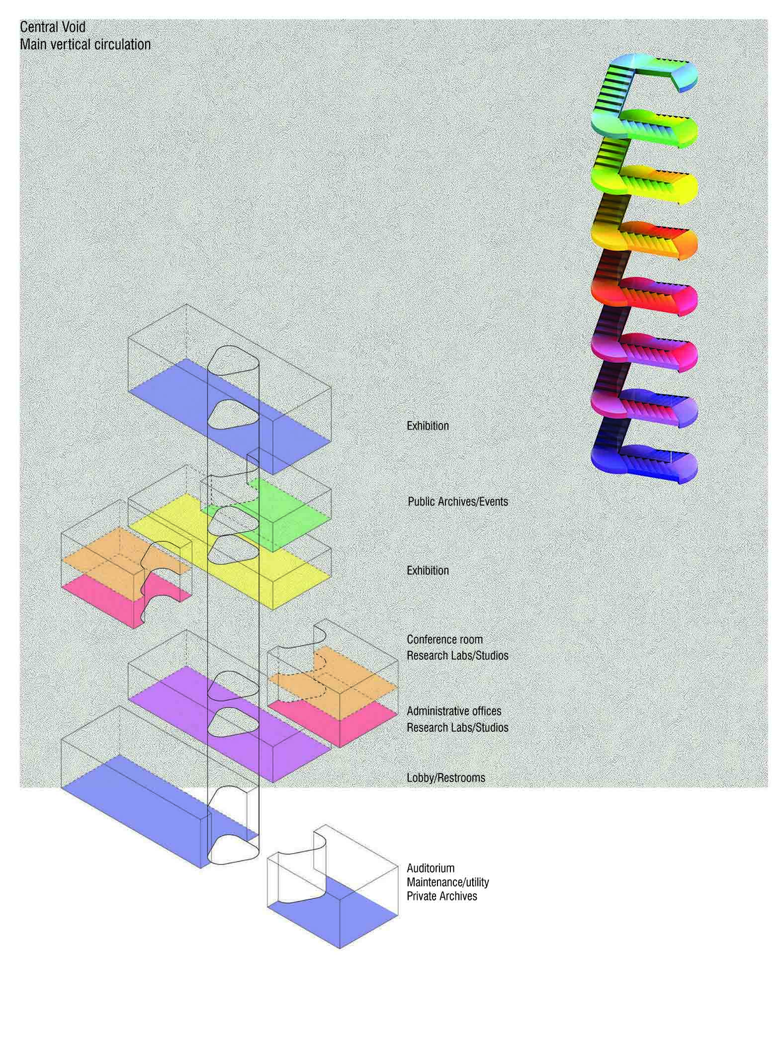
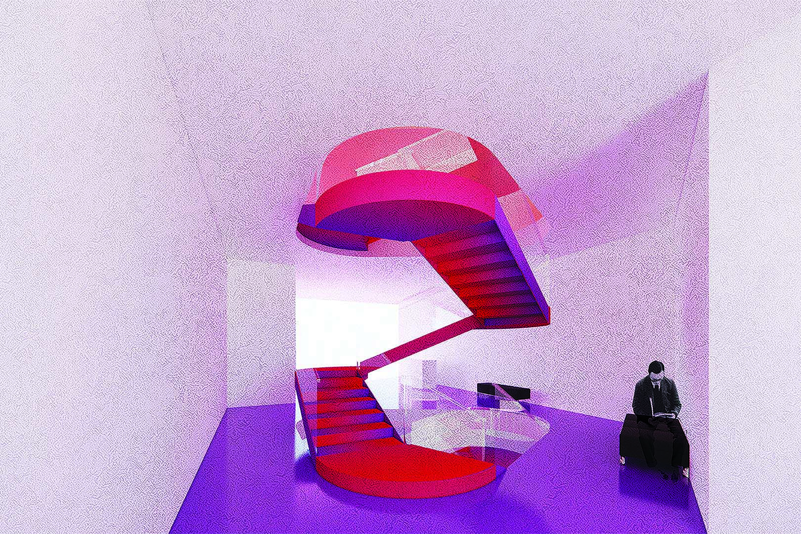
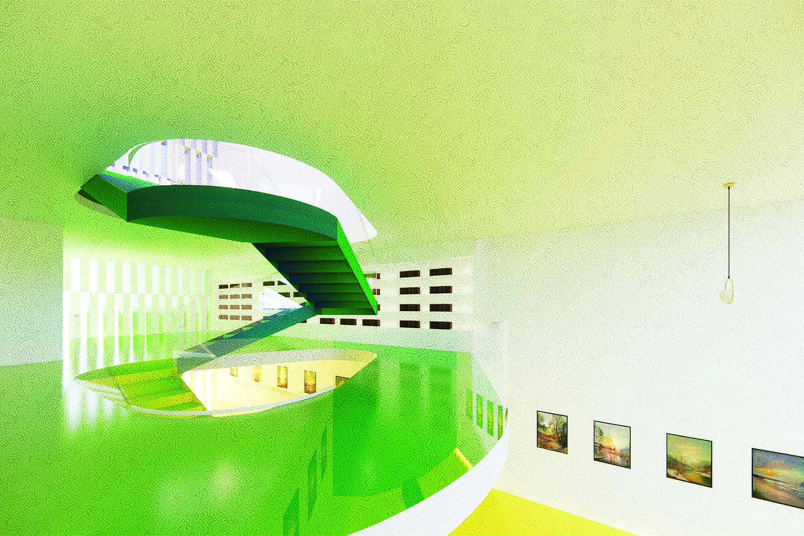
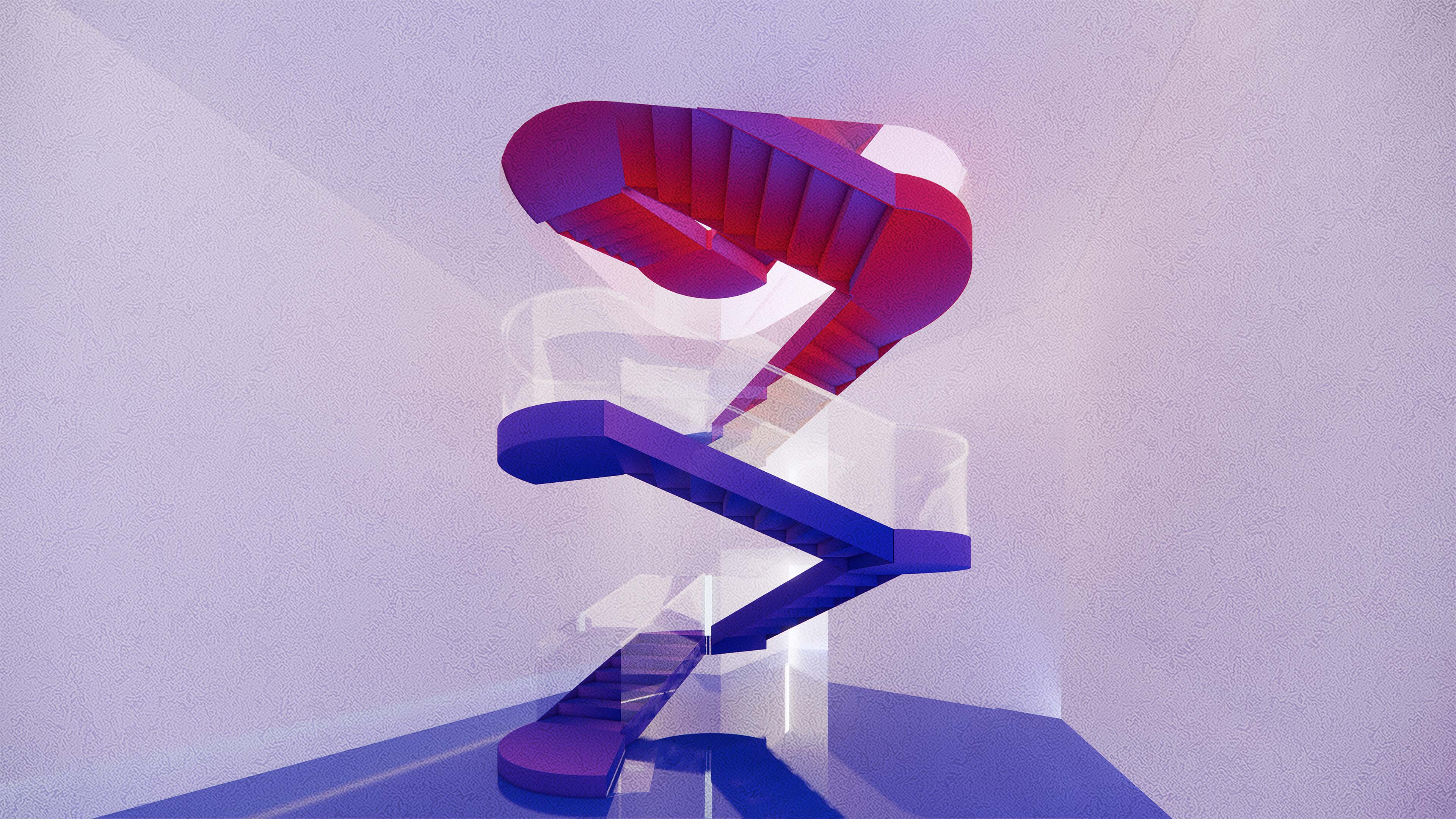
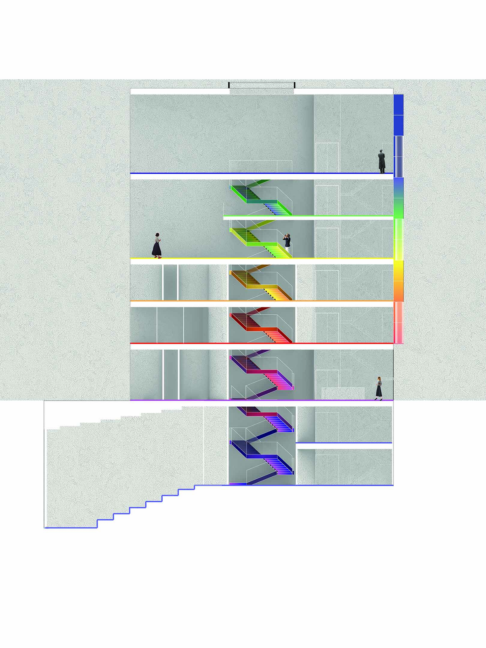
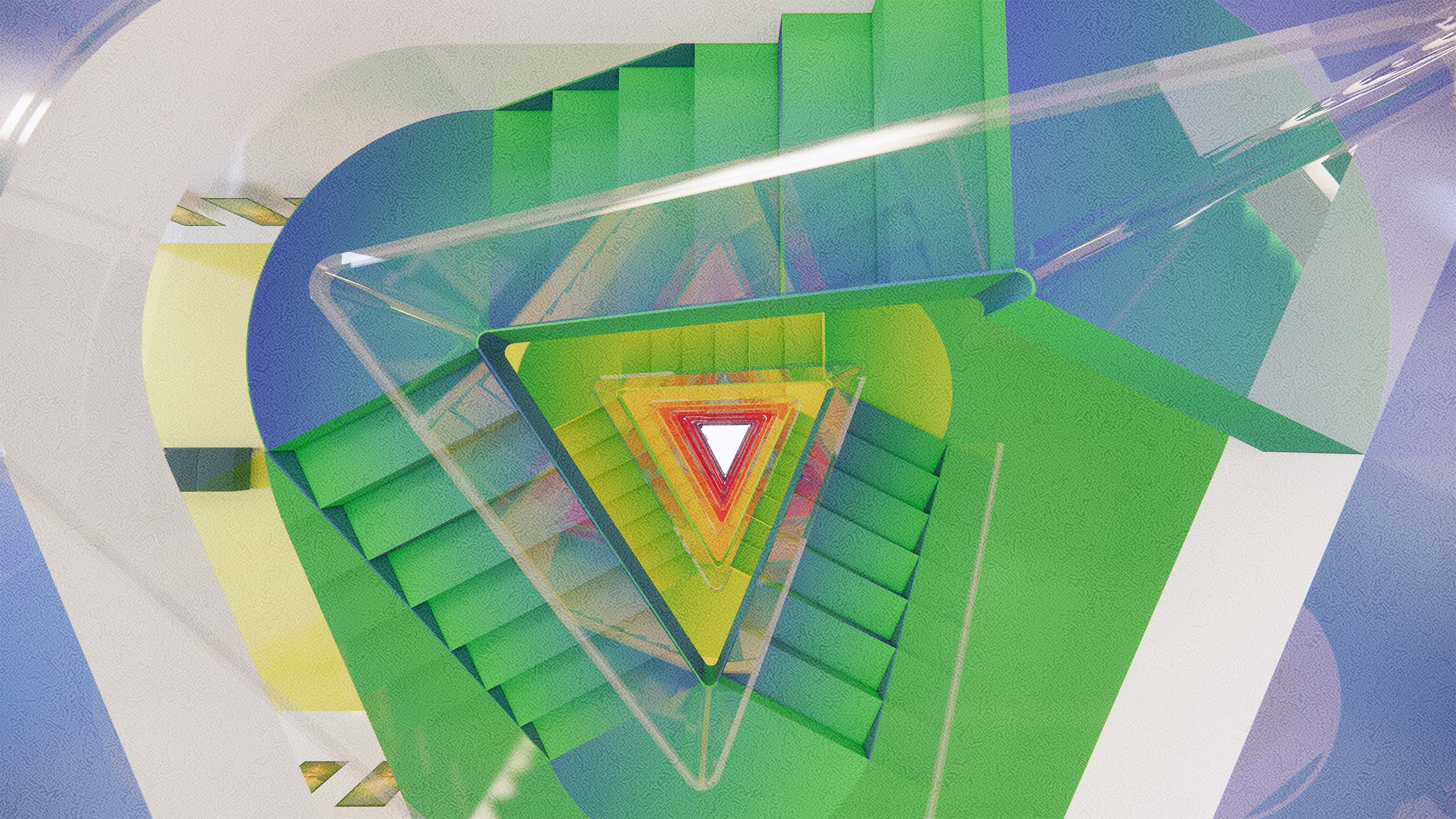
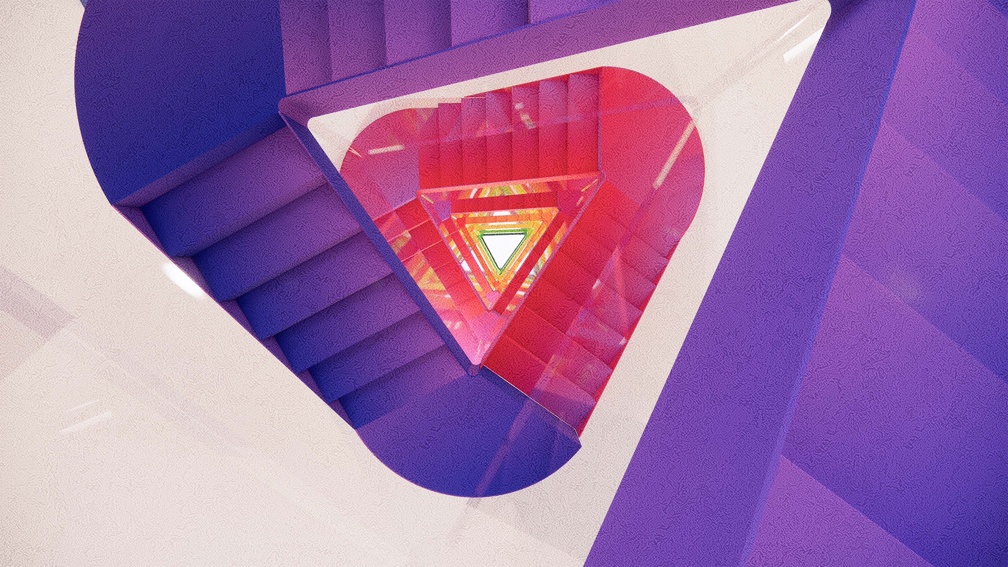
The program includes exhibition spaces, offices, studios, archives, and an auditorium. The project is defined by the integration of a central void that is connected to all spaces and inhabits the main staircase. The geometry and design of the staircase follow a concentric circulation. The circulation allows visitors to observe artwork potentially placed on the walls that embrace the void on some levels. For public spaces, the central void serves as a connection to open floor plans. However, for private spaces, the void integrates partition walls to create privacy. The hierarchy of the program is presented as double-height spaces that create a different spatial experience from other spaces in the building.
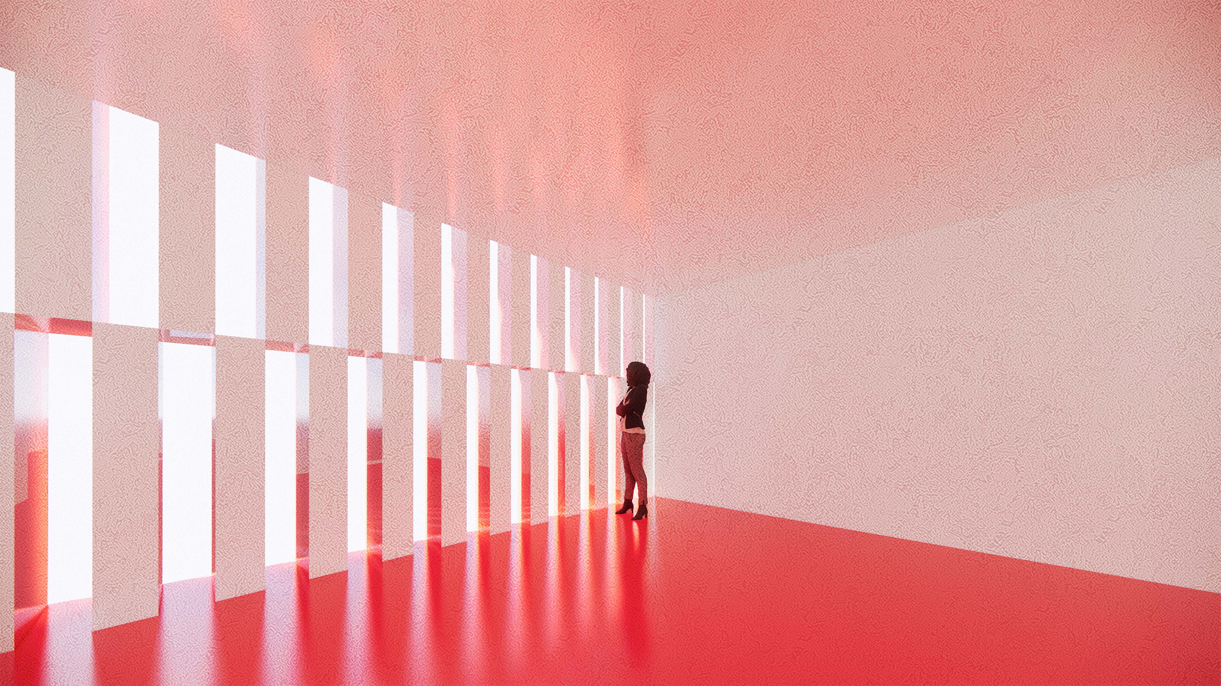
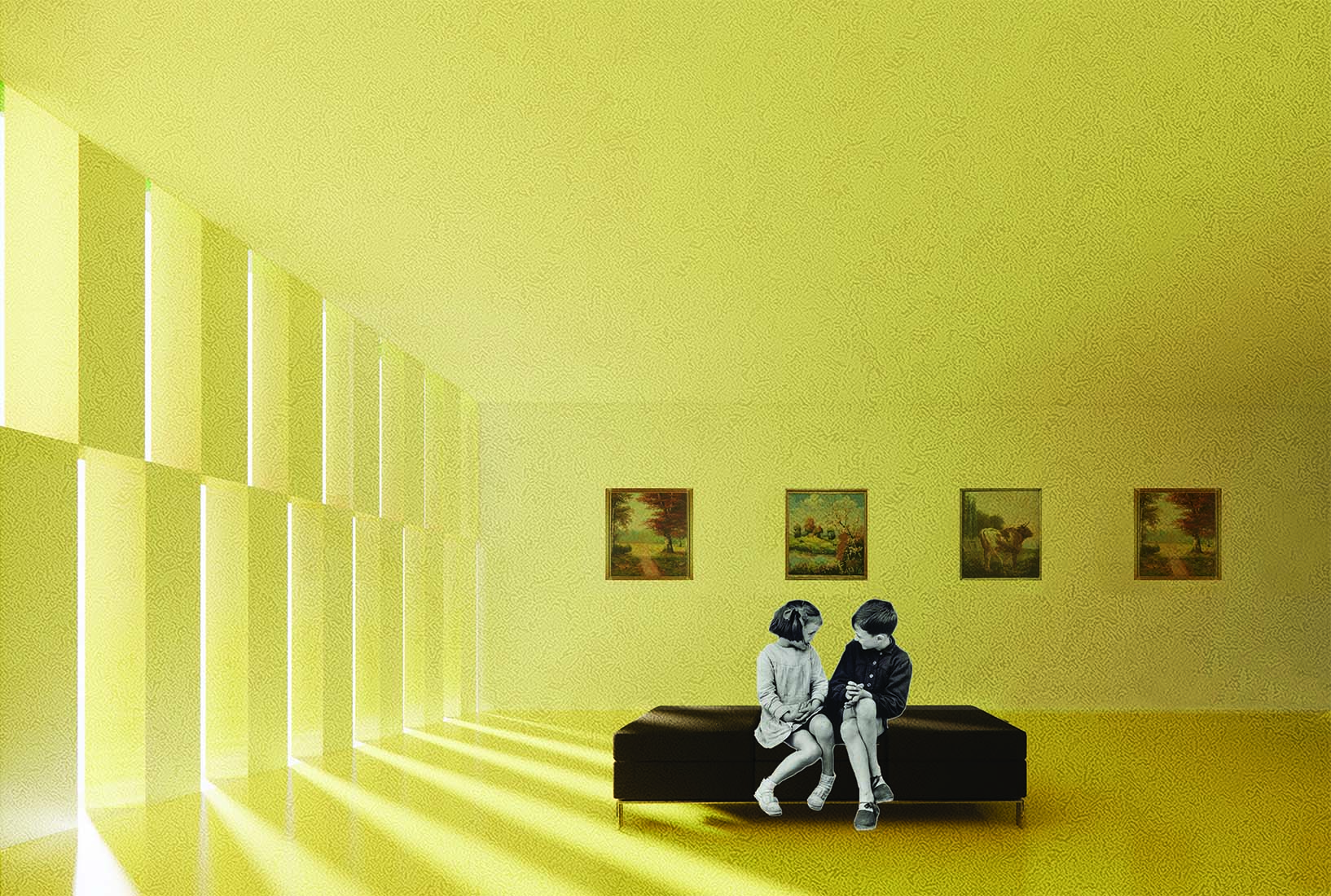
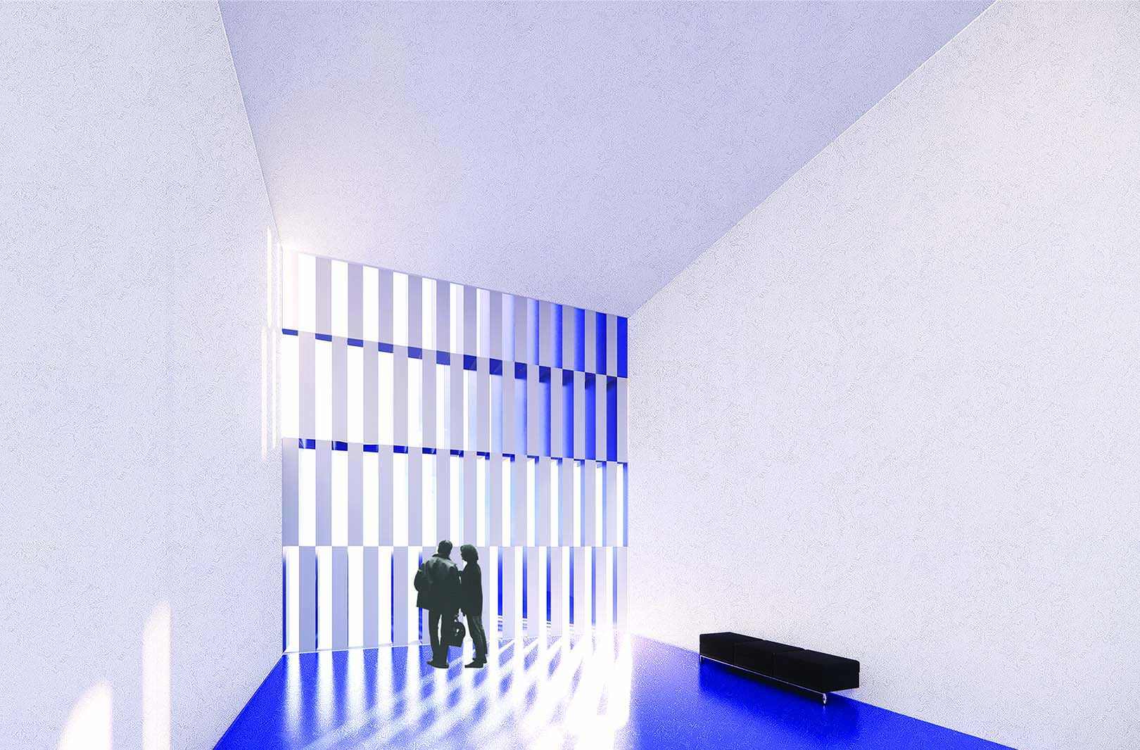
The color strategy integrates primary and secondary colors that are connected by the corresponding gradient range between them. The main vertical circulation serves as the analogous connection between one color to another. The surrounding surfaces are white so the visitors can focus on the transition of colors from the main staircase. The project considers interior and exterior relationships and highly emphasizes the entrance of natural light into the interiors with the purpose of achieving different light and color effects depending on the time of the day and the year.
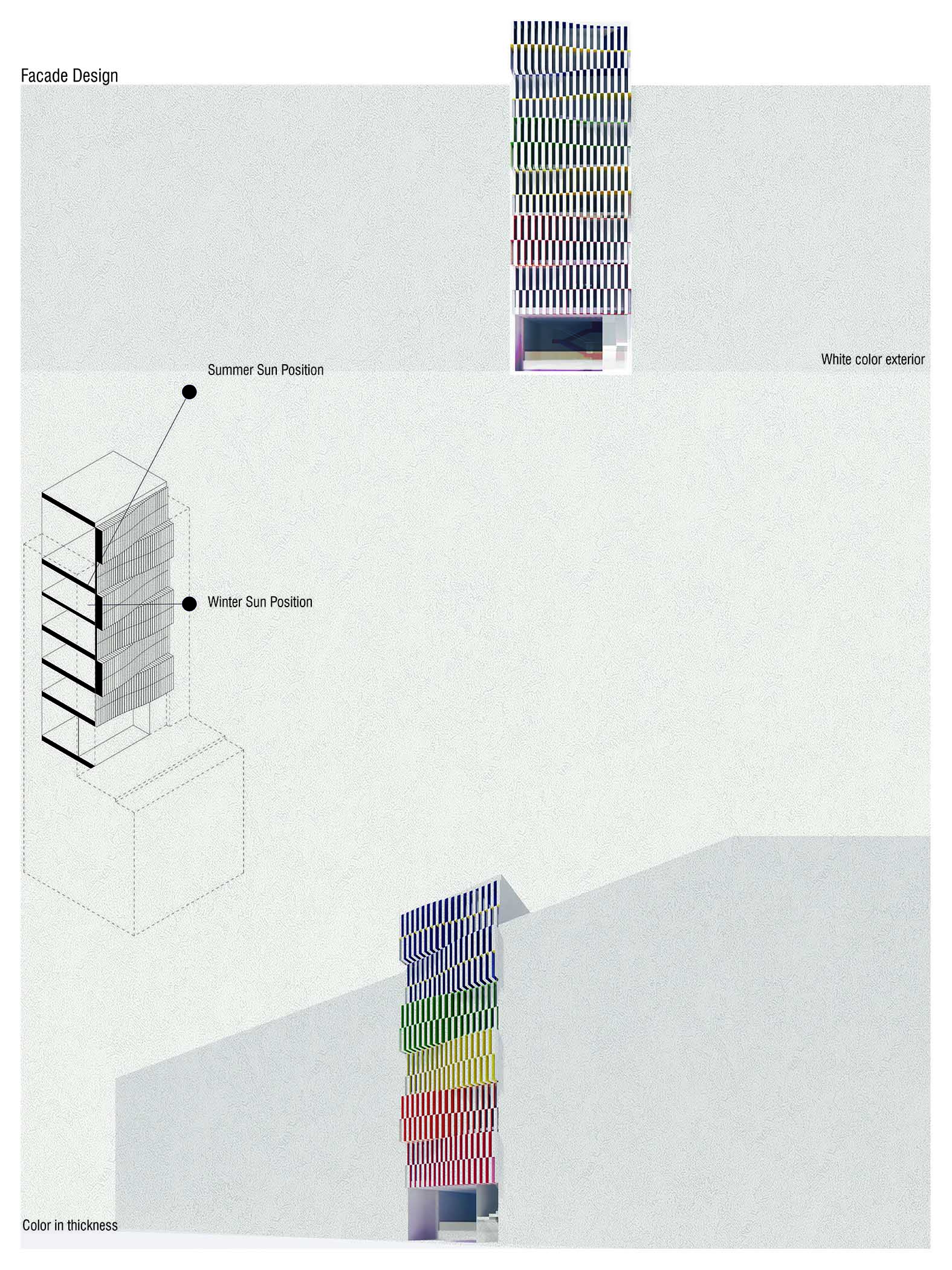
The facade design controls the amount of light the interior receives to have indirect light pouring into the spaces. The exterior facade is a modern interpretation of rectilinear forms used in the context of the site. It uses white as a neutral exterior color that contains the transition of colors from the main vertical circulation in the thickness of the louvers, these colors can be perceived from an exterior perspective view outside the building. The selection of colors generates a reference from the color wheel star as a means to embody, through an architecture of color, the values of the institute. The section of the project becomes a datum of how you navigate the colors. The staircase serves as a model of that spectrum and the thickness of the facade structure broadcast those colors outside.
Spring 2020 Design Excellence Award Winner
Ingrid Paulina Gallegos
Interior Design Core II
Instructor: Igor Siddiqui