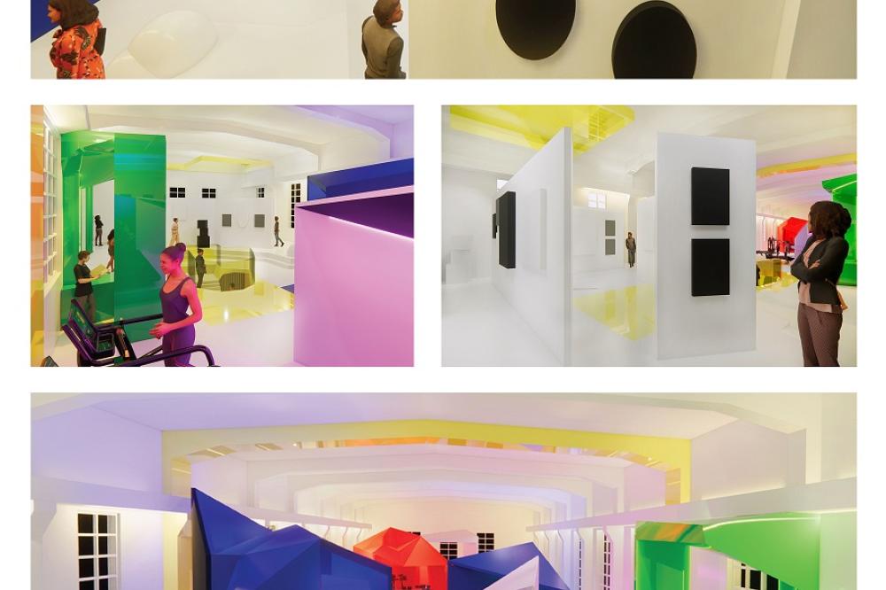
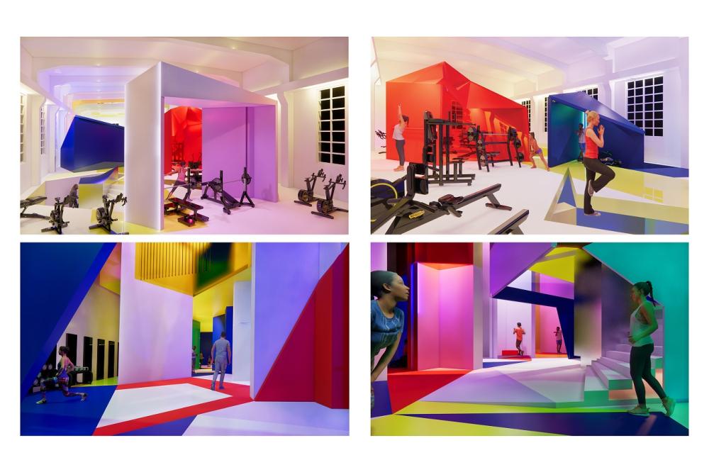
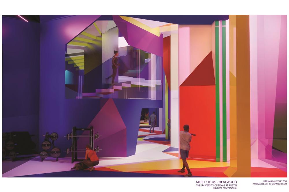
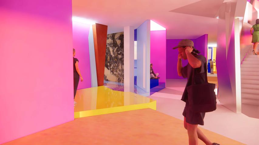
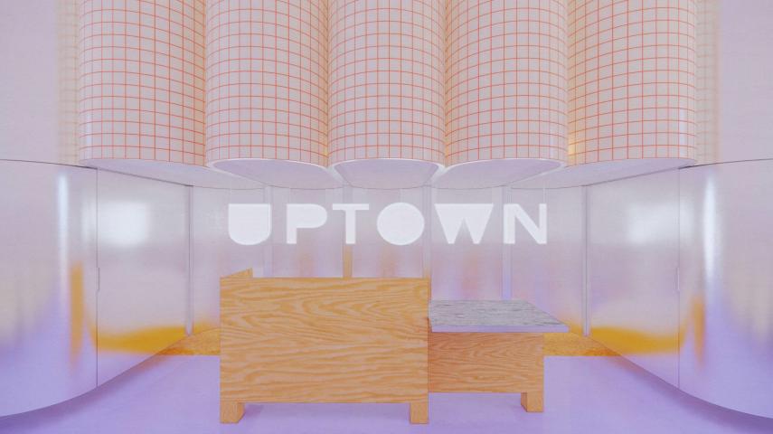
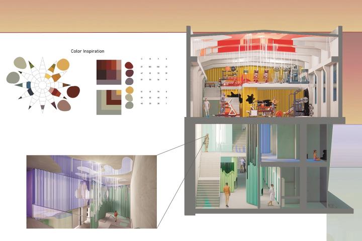
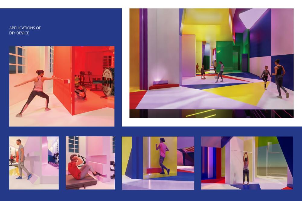
 Expand view for photograph In this design board, people interact with colorful, geometric indoor structures, performing various fitness and movement exercises. The scenes are vibrant, featuring bold red, yellow, purple, and blue lighting and walls in a modern, creative environment.
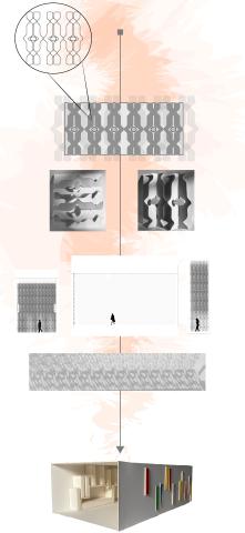
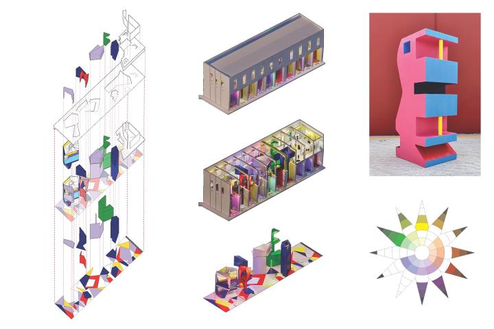
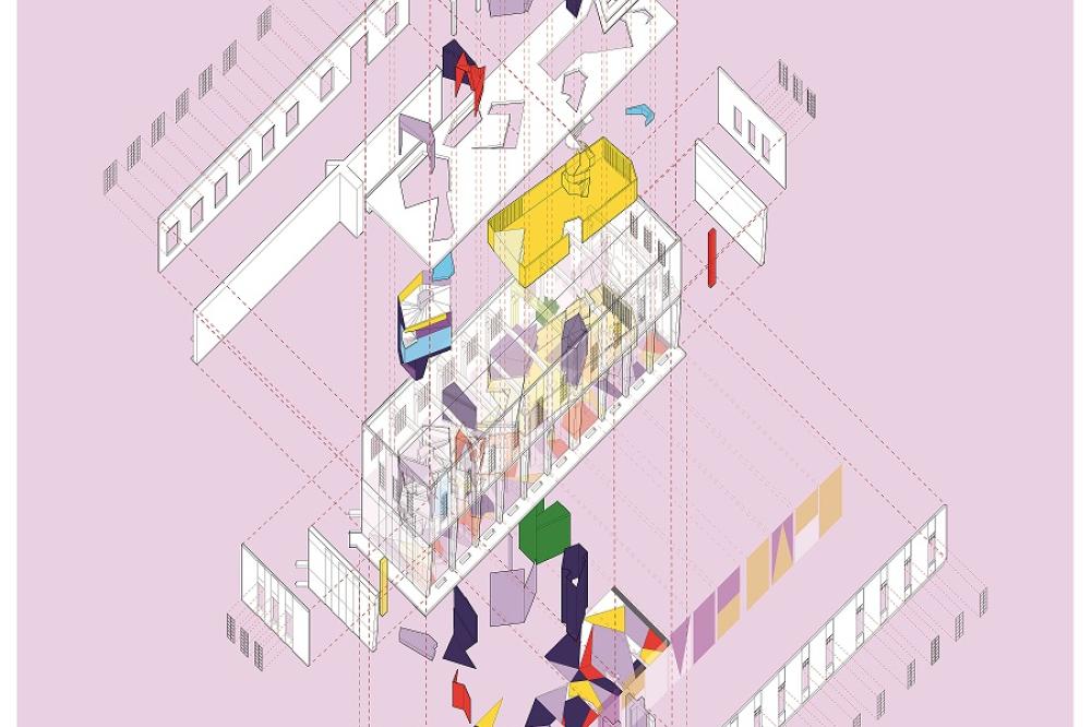 Expand view for photograph Exploded axonometric diagram of a building with multiple colorful floors, rooms, and geometric elements, displayed on a light pink background. Each floor is separated vertically and includes abstract shapes and partitions.
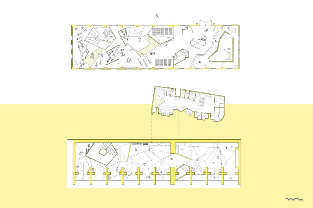
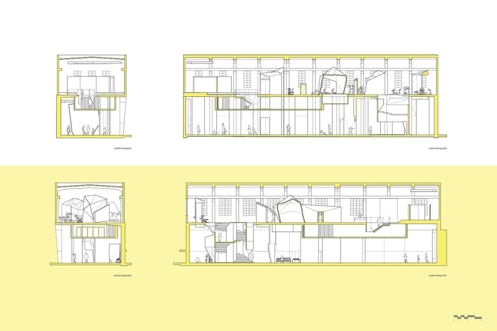
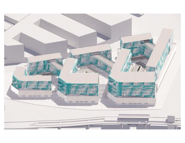
I began reconfiguring the form and character of the Seaholm site with a tessellation on the basement floor plate that connected the rectilinear planes of the building. This became a spatial device that began to imply new subdivisions within the elongated volume of the bottom level, allowing me to activate a dynamic interior that diverged from, but did not wholly undermine, the existing architecture.
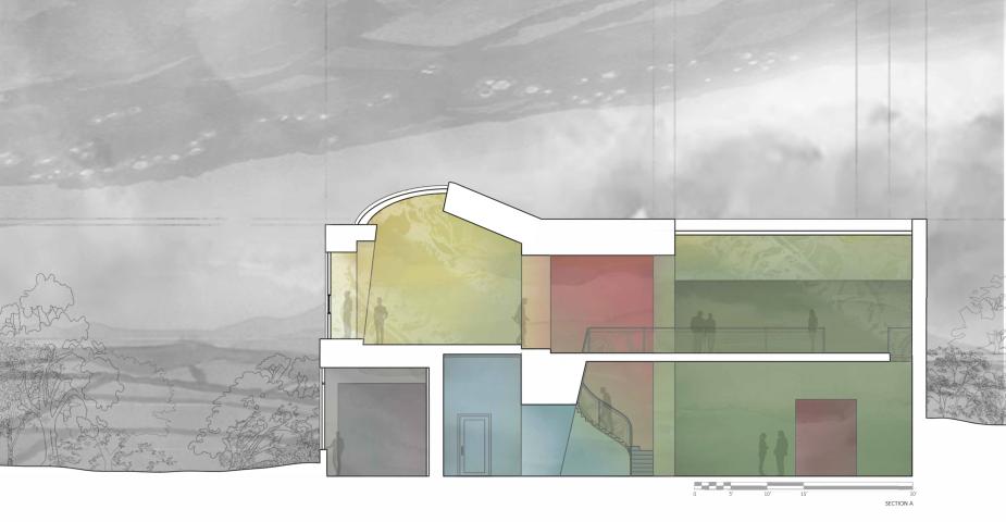
I then chose to three-dimensionally express the geometry of my mosaic via multifaceted volumes that rose through the ceiling and breached the second floor. These irregular shapes inserted a different formal language within the organized and repetitive structure of the upstairs, and, once hollowed out, became rooms within which different programs could take place. My “gym gallery” is also located on the second floor, composed of two folded partitions whose polygonal irregularity imitates the other volumes.
In considering the relationship between exercise and fun, I decided to pursue the theme of an“adult playground,” which established an expectation that there would be little to no rules or regulations as to how the gym is navigated, or how the programs of gym and gallery interact. This theme is also expressed through the vibrant color palette, which pulls from every segment of the spectrum with priority given to highly saturated colors. Though this is an atypical gym, the language of the equipment and occupants assists in communicating the purpose of the space regardless of its form, which came with the arrangement of the gallery space and its program. I felt that I had the freedom to push the interior in whichever direction, and I wanted to pursue that liberty for the sake of answering the question: how do you achieve the necessary groundedness of required program, services, and equipment while still nurturing the idiosyncrasies of an unconventional design?
Meredith Cheatwood
Interior Design Core Studio II
Instructor: Igor Siddiqui


